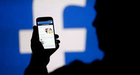
Facebook is blue because Mark Zuckerberg is red-green color blind. Blue is the only color he can see clearly. "Blue is the richest color for me — I can see all of blue," he told The New Yorker in 2010. One man's biology dictated the look of a platform used by 3 billion people.
Why Facebook Is Blue: Zuckerberg's Color Vision
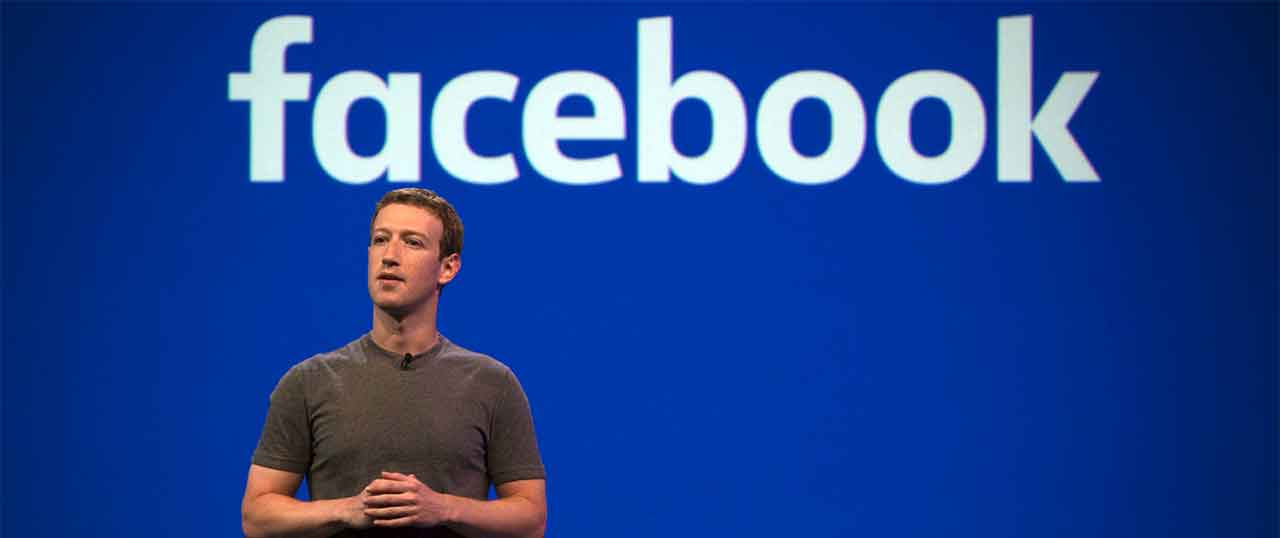
When Mark Zuckerberg was designing Facebook in his Harvard dorm room, he faced a peculiar challenge that would shape the platform's iconic look. The choice wasn't driven by focus groups, brand consultants, or aesthetic trends—it came down to how his own eyes perceived color.
Zuckerberg has red-green color blindness, a condition affecting roughly 8% of men. For him, the world doesn't look quite the same as it does for most people. Reds appear muddy, greens look confusing, but blue comes through crystal clear.
A Design Born from Biology
In a 2010 interview with *The New Yorker*, Zuckerberg confirmed what many had suspected: "Blue is the richest color for me—I can see all of blue." This simple biological fact influenced one of the most recognized brand colors in the world. The decision wasn't about market research or psychological manipulation—it was about choosing a color he could actually see properly while coding and designing for hours on end.
Think about the implications for a moment. Facebook's signature blue appears on over 3 billion devices worldwide. It's been seen trillions of times. And it all started because one college student needed to pick a color palette he could work with comfortably.
How Color Blindness Actually Works
Red-green color blindness occurs when photoreceptors in the eye don't function normally. The condition has several variations:
- Deuteranomaly (most common): Green appears more red
- Protanomaly: Red appears more green and dimmer
- Deuteranopia/Protanopia: Complete inability to distinguish red and green
Blue wavelengths, however, are processed by entirely different cone cells in the eye—ones that typically work normally even in people with red-green color blindness. This is why blue remained Zuckerberg's safe choice.
The Accidental Branding Genius
What started as a practical necessity turned into brilliant branding. Blue conveys trust and stability—qualities essential for a platform asking people to share personal information. It's the most universally liked color across cultures. And unlike aggressive reds or energetic oranges, blue doesn't fatigue the eye during long browsing sessions.
Was this strategic? Not initially. But sometimes the best design decisions come from embracing constraints rather than fighting them. Zuckerberg's color blindness created a limitation that led to an optimal outcome.
Other tech giants have their signature colors—Google's rainbow, Twitter's light blue, Instagram's gradient. But Facebook's deep, consistent blue became synonymous with social networking itself. For years, "Facebook blue" was as recognizable as Coca-Cola red or Tiffany's robin's egg blue.
A Personal Touch in a Tech Empire
Today, Meta (Facebook's parent company) has evolved beyond a single blue interface. But that original choice reminds us that even the biggest platforms start with human decisions—sometimes driven by the most personal of factors. Every time you scroll past that blue notification icon, you're seeing the digital world through the lens of one person's unique vision.
Frequently Asked Questions
Why is Facebook blue?
Is Mark Zuckerberg colorblind?
What type of colorblindness does Mark Zuckerberg have?
When did Facebook choose the color blue?
How did Zuckerberg's colorblindness affect Facebook's design?
Verified Fact
This fact has been reviewed and verified against original sources.