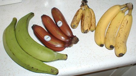
The colors red, yellow and orange are not recommended for use in kitchens if you're trying to lose weight as they are known to stimulate appetite.
The Colors That Make You Crave: Appetite & Hue
Ever walked into a vibrant kitchen and suddenly felt a rumble in your stomach? It might not just be the aroma of a delicious meal. The colors surrounding us, especially in an environment like a kitchen, can have a surprising impact on our appetite and eating habits.
For those looking to manage their weight, understanding the subtle influence of color psychology can be a game-changer. It turns out, the old adage about warm colors stimulating hunger holds a good deal of truth.
A Warm Welcome to Hunger
Colors like red, yellow, and orange are frequently cited as powerful appetite stimulants. Red, with its association with energy, passion, and urgency, can subtly increase heart rate and blood pressure. This physiological response can translate into a heightened sense of hunger and a tendency to eat more quickly.
Yellow, often linked to happiness and warmth, creates a cheerful and inviting atmosphere. While pleasant, this cheerfulness can also make us feel more comfortable and inclined to indulge. It’s why many food brands use yellow in their logos and packaging.
Similarly, orange blends the stimulating effects of red with the inviting nature of yellow. It evokes feelings of enthusiasm and warmth, making food appear more appealing and leading us to desire more.
Fast Food's Secret Ingredient
This isn't just anecdotal observation; it's a carefully studied phenomenon. Fast-food giants have long capitalized on the psychological effects of color. Take a moment to think about the prominent color schemes of popular burger joints or pizza places.
- Many incorporate bold reds and yellows into their branding.
- These color combinations are strategically chosen.
- They aim to stimulate hunger and encourage quicker dining experiences.
- The goal is often to increase impulse purchases and customer turnover.
By creating an environment that subtly nudges consumers towards craving and rapid consumption, these establishments maximize their business model. It’s a powerful, non-verbal cue that communicates 'eat now!'
The Science Behind the Shades
So, what exactly is happening beneath the surface? Research in color psychology suggests that our brains process colors in ways that can affect our physiological responses. Warm colors are often associated with ripe, ready-to-eat foods in nature, such as berries or citrus fruits.
Some studies indicate that these colors might even influence the production of certain neurotransmitters. While more research is always ongoing, the general consensus points to a clear connection between warm hues and increased appetite perception.
Cooling Down Cravings
Conversely, if you're trying to curb your appetite, you might consider leaning towards cooler colors. Blue and green are generally considered appetite suppressants. Blue is rarely found in natural foods, making it less appetizing in a culinary context.
Green, while associated with freshness and health, typically doesn't trigger the same hunger response as its warmer counterparts. Many diet plans or healthy eating initiatives often feature green prominently in their branding for this very reason.
Designing Your Diet-Friendly Kitchen
If weight management is a priority, rethinking your kitchen's color palette could be a useful strategy. Opting for cooler tones on walls, cabinetry, or even accent pieces might create a more subdued and less hunger-inducing environment. Consider these elements:
- Wall colors: Pale blues, cool greens, or even grays.
- Dishes and serveware: Choose blue or green plates.
- Lighting: Cooler-toned lighting can also play a role.
Even small changes, like using a blue tablecloth or placemats, can subtly shift the psychological cues in your dining space. While color isn't the only factor in appetite, it's a fascinating and often overlooked tool in the journey towards healthier eating habits.
Frequently Asked Questions
Do colors really affect appetite?
Why do warm colors stimulate hunger?
What colors should I use in my kitchen if I'm trying to lose weight?
Is there scientific proof that colors affect eating?
Why do fast-food restaurants use red and yellow so much?
Verified Fact
Scientific research and common practices in marketing (e.g., fast-food branding) support the idea that warm colors like red, yellow, and orange can stimulate appetite. Multiple studies indicate these colors can subconsciously influence hunger and food choices.
Related Topics
Enjoyed this? Get a fun fact daily.
One fascinating fact, every morning. No spam, unsubscribe anytime.
